Assignment 5_1: Sketching/Wireframes
Wireframes definition:
"A website wireframe, also known as a page schematic or screen blueprint, is a visual guide that represents the skeletal framework of a website. The wireframe depicts the page layout or arrangement of the website’s content, including interface elements and navigational systems, and how they work together. The wireframe usually lacks typographic style, color, or graphics, since the main focus lies in functionality, behavior, and priority of content."
Take a pencil and draw on the printouts (with grids) we'll give you. Place elements (text, images) in the grid. Pay attention to size and proportions of sections and elements. Look for visual dynamic, contrast and balance.
Since this microsite will be responsive you need to create layout "versions" for different screen sizes. For the sketches and designs, you'll create layouts for big (desktop), medium (tablet) and small (smartphone) screens. Make decisions about what sections/elements you need to adjust in order to optimize usability/legibility on small screens. In other words: make the layout fit, avoid horizontal scrolling and make text big enough to read and size the text links so that people can navigate on touch screens without the need to zoom in/out.
Sketch 2 different design ideas for this microsite. Since the building pages will most likely be similar you only need to create sketches for 2 pages: The landing/home page and one building page. Since you need to create layouts for 3 screen sizes you'll end up with 12 sketches total (1 idea has 3 size variations for 2 pages = 6 sketches per idea).
Due: Nov 3., beginning of class
Wireframe grid handouts. Sketch sheets for desktop, tablet and mobile sizes.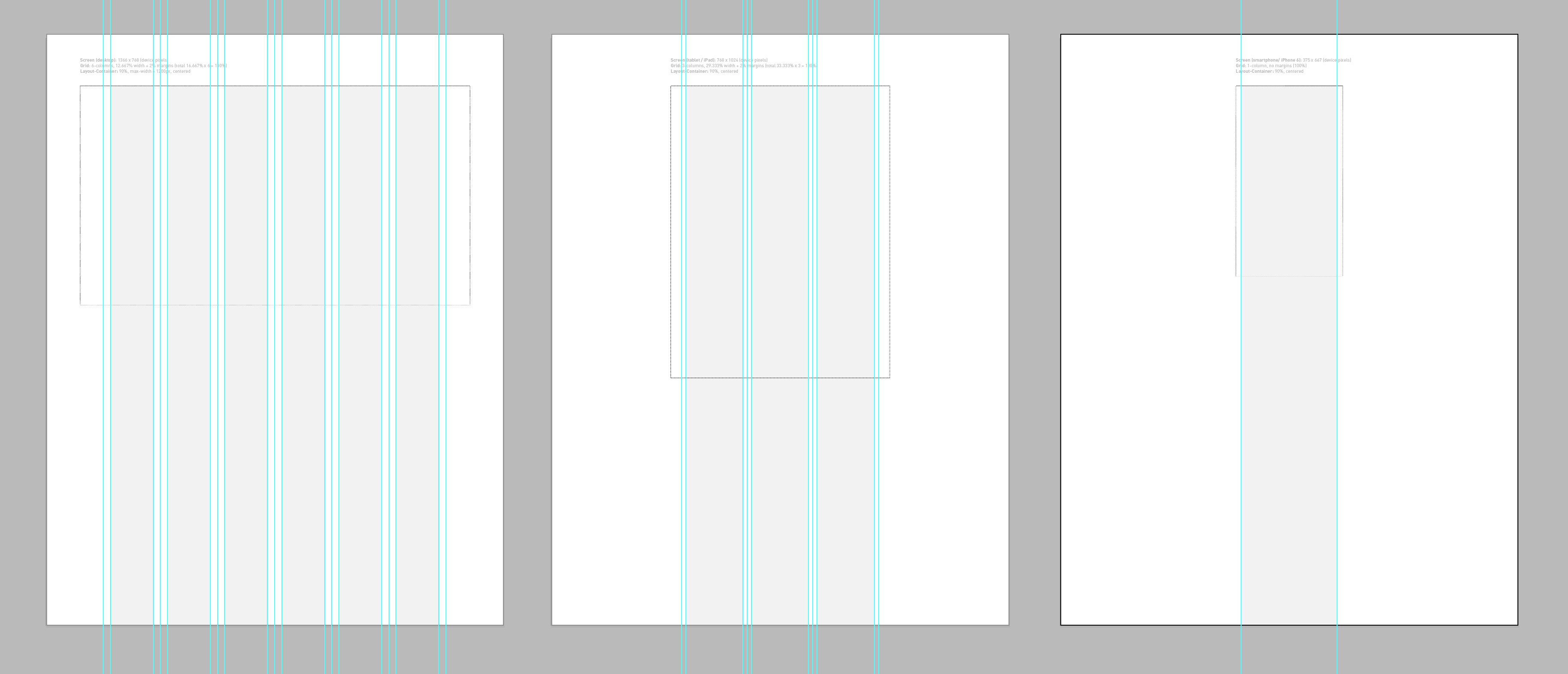
You can download the Illustrator grid templates here.
Structuring content (text, images...)
Organizing and prioritizing information on a page helps users understand a message quickly and in what order to read things.
Prioritizing
If everything on a page appeared in the same style, it would be much harder to understand. (Key messages would not stand out.) By making parts of the page look distinct from surrounding content, designers draw attention to (or away from) those items. Designers create a visual hierarchy to help users focus on the key messages that will draw people's attention, and then guide them to subsequent, less important information.
Organizing
Grouping together related content into blocks or chunks makes the page look more organized (and easier to understand). Users should be able to identify the purpose of each block without processing each individual item.
Visual Hierarchy
Most web users do not read entire pages. Rather, they skim to find information. You can use contrast to create a visual hierarchy that helps people understand the most important information immediately. Hierarchy refers to the order in which your eyes perceive what they see. It is created by adding visual contrast between the items being displayed. Items with higher contrast are recognized and processed first.
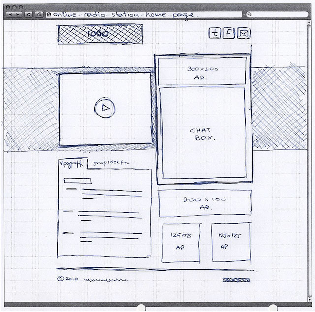
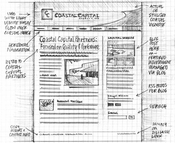
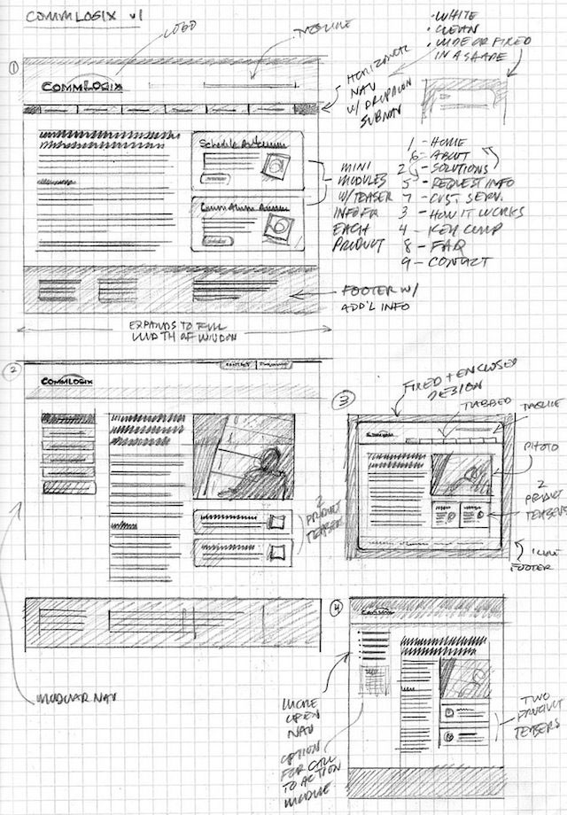
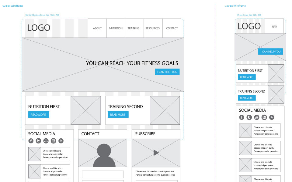
Examples of wirefame sketches